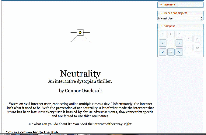
With continued development on my text adventure game, I’ve finally implemented a working, albeit somewhat simple quest.
Starting from where I left off in the last post, the player is made aware of their first quest by talking to the disgruntled internet user in the first room of the game. As was shows in a previous screenshot, by talking to the user, the player finds out that they need to somehow get faster access to “Friendbook”


By asking a series of questions related to the words in bold, I’m able to finally discover how I can help the character; by finding an object called a “Proxy unit”. Despite the fact that the player now has an objective to fulfil; if they so wish they can continue to talk to the user to discover tips or learn more information about the world; including the discussion of real-world issues related to the internet such as network advantages and DDOS attacks. An example of this can be seen in the screenshot below.

By doing this, not only am I trying to make the world seem more real by providing background information for the player to discover, but also in an attempt to somewhat disguise one of the biggest problems with classic-style text adventure games: conversation. From when these style of games were first released in the mid-70’s, and all the way through the 80’s while they were still popular; one of the features developers tried to push was the illusion of being able to say anything to any character within the game world and receive a relevant response, making it seem like a real, dynamic conversation. However, much like the game I’m creating, this process was often flawed and relied on the user typing a series of key words for which there is a pre-scripted response to.
As is written in the book Game Design by Andrew Rollings and Ernest Adams, “A few early text-based games tried to implement parsers that could understand limited English sentences as typed by the player, but these seldom succeeded. You got either an NPC saying “I don’t understand that” when you asked a perfectly reasonable question, or an NPC whose answers weren’t quite to the point, giving the impression that he was drugged or mentally ill.” (Rollings, A and Adams, E. Game Design, 15, 469.)
These issues are the reason I’m using pre-scripted responses to phrases that are highlighted to the user; any attempt to hide this would mean that not only does the player have to try and understand what they need to be asking (which could get very complicated), but there would be no sense of guiding them along. Much like the use of “quest markers” in more modern games, especially RPGs like Skyrim, which are designed to show the player where to go without having to open a map or menu (a problem in many older games), in much the same way, the conversation topics in bold serve to guide the user while avoiding being obtuse. They may be a bit obvious, but it’s better than the player not understanding what they need to say and do.

With the player now understanding that they need to find a “proxy unit”; the next step is actually finding the item. Looking back at the conversation with the internet user, the player understands that it might be worth looking in eBought; an in-game parody of eBay. Because my game is set in a virtual reality space, different websites serve as different “rooms” for the player to travel to, and each one is physically represented as, for instance, eBought is a gigantic market bazaar where all sorts of users are selling all sorts of things.

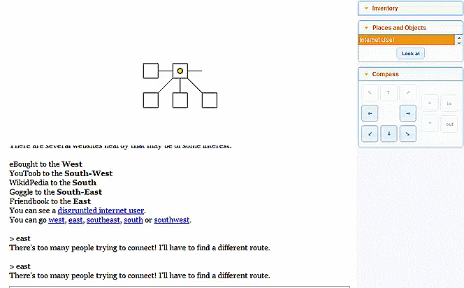
The screenshot above shows the interactive interface that is present when playing a game in the Quest engine. Unlike older text adventure games, this is far more user-friends, including panels for inventory management, navigation and a compass for movement around the game. There is even a map which is updated in real-time as the user moves around to prevent them from becoming lost. These features help to make the game a lot more accessible to people who may otherwise ignore it.

Here you can see the location of other “rooms” relative to the players position: from the starting point of the game, there are 5 different rooms the player can travel too, but only 4 that can be accessed upon starting a new game; trying to go east to Friendbook fails due the line of people waiting to access the website. Until the quest is completed, the user will be unable to access this area. However, we can see that eBought is to the west, and that’s where the Proxy unit is supposed to be, so it would be a good idea to head there.
This gif stands as a good visual example of the game itself, movement and object interaction.
Now that the player has acquired the proxy unit, they now need to go back and give the internet user the proxy so that Friendbook can be accessed.

Upon handing the user the object, he opens up a way for the player to proceed into the next area.
The gif below shows the full process of completing the quest, without the conversation.
It may only be a simple “fetch-quest”, but it’s a solid start and I think it works well as an introductory quest. The book I mentioned earlier, Game Design, has a few pages discussion the sorts of things to avoid during the development of an adventure game;
– Puzzles solvable only by trial-and-error
– Conceptual non-sequiturs (e.g; “sharpen the headphones with the banana”)
– illogical spaces
– Puzzles requiring outside knowledge
– backwards puzzles (Finding the solution before finding the puzzle itself)
– Too many “FedEx” puzzles (The actual puzzle I have designed above; however they are simple and good for letting a player get to grips with mechanics without any pressure to think critically or finish the puzzle quickly. Once the player is familiar with the game, however, these quests shouldn’t make an appearance.)