Liberation R&D – 3

Jumping straight off from where I left yesterday, I thought that perhaps a good way to represent the internet as non-neutral would be to have two people perform the same activity, but with one slowed down against their will, with nothing they can do to complain. The reason for this is because without net neutrality, ISPs will be able to slow speeds of other users on their network just because they’re with a different ISP.

For example, if two people try to toast bread at the same time, on the same settings with the same bread, but with two different toasters, somehow making it so one of the toasters takes a much longer time to get the same result as the other toaster.

This is just an example, but if I could think of a way of further developing this into a physical project, I think this is the idea I would like to go with.

—-

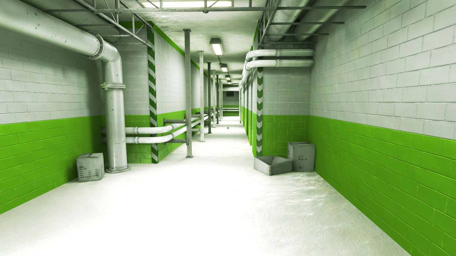
How about a simple multiplayer game where the users have to run down a corridor, or around an arena full of obstacles to collect several items. However, at the beginning of each new round, one of the characters is randomly selected to have the input simulate high network latency. This idea could be expanded to accommodate more players or new systems.

In the book Game Design by Andrew Rollings and Ernest Adams, chapter 6 of the introduction talks about game design and the elements needed to create a good experience for the user, such as the interactivity, visual and sound design.

Interactivity

As much of a message as I am trying to send with my game and the gameplay elements within it; the game itself should still be entertaining to play. As a progression to the idea I had above, I think that a game such as Mario Kart would be a perfect way for my own game to play; the users have to race around a track which is based upon an aspect of the web (Ie; social networking) and try to be the first one to the end. Along the way, users can obtain power-ups which are a representation of ways that the non-neutral internet is negatively affecting users. an example of this would be a power-up that can slow another user down by simulating high network latency, or another power-up that can “blind” the player by censoring the game for a short amount of time.


Visual Design

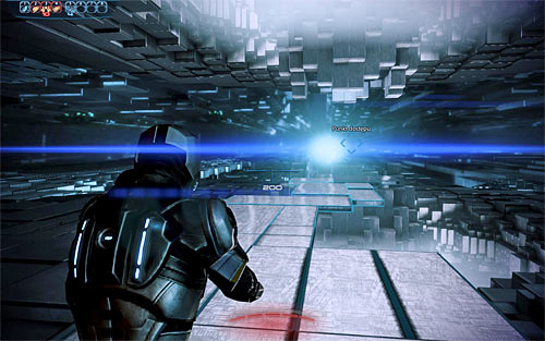
I’d like my game’s visual design to be clean and simple yet stylised; a lot like mirror’s edge, but unlikely to be as smooth or polished. I want my game to have visuals that serve as an interpretation to what a physical online space may look like.

A screenshot from Mirror’s Edge showcasing the clean, simple and yet recognisable visual design.

Many games over the years have had their own interpretations as to what a visualised online space might look like. For example, here is a screenshot of Mass Effect 3, taken from a mission involving the exploration of a massive online neural hub.

A physical online space in Mass Effect 3.

And finally another from Metal Gear Solid’s “VR missions”; an online virtual reality training simulation that exists within the Metal Gear universe.

This screenshot from Metal Gear Solid showcases the VR interface; a simple, mono-colour space set in an endless void of computer code.

As for the characters; I think it would be rather effective to have the players represented by nondescript, neutral characters and the vehicles represented as simple computer mice. The statistics of each player could be sourced from the average connection speeds (and other data) from real-world ISPs.

Sound Design

Audio would be a standard fare; a simple techno beat could serve as generic background music, with error sounds and effects used for the use of power-ups, game overs, finishing the race and more.


——

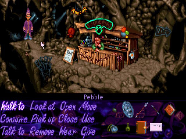
Further developments: An ADVENTURE game! While I would love to make one in the style of say, Myst, I could just make a simple point ‘n’ click game 90s style, or an even earlier text-based adventure like The Hitchikers Guide to the Galaxy. The game would act as a tongue-in-cheek adventure through the modern web, but in a dark future where net neutrality has failed to gain traction and as such, much information is blocked, there is no anonymity and other events such as slow-downs, throttling and congestion could occur.

Interactivity

The game would play like your standard point and click game; with a visual interface showcasing the game world and characters, with a menu underneath featuring actions the player can take such as “talk to” or “pick up”. The only mode of interactivity would be through mouse clicks, and as such playing the game would be a very simple affair.

This screenshot is from Adventure Soft’s 1993 DOS game, Simon the Sorcerer. It’s a good showcase for what point and click interfaces looked like at the time.

Visual Design

Like many games of the type that came out in the late 80s – mid 90s, the graphics would be based on 32-bit pixel art, such as that seen in Lucas Arts’ The Secret of Monkey Island or The Dig. However, these games where made by a team of professionals, so more than likely many of my sprites will be taken from open-source projects.

A screenshot from the HD remaster of The Secret of Monkey Island (1990)
A screenshot of Lucas Arts’ The Dig. (1995) It features much higher-quality and complex scenes than Monkey Island.

Sound Design

Like many early adventure games, my game won’t feature voice acting or complex music, instead relying on simple custom music to fit the theme of the scene currently being shown on screen.

The software used to create my game can be downloaded for free from http://www.adventuregamestudio.co.uk/

Further open-source engines can be found here: http://html5gameengine.com/

Liberation R&D – 2

Having mulled over my thoughts from yesterday, and the concepts of freedom that the Magna Carta represents, I’ve decided to take a look at Net Neutrality. Net Neutrality stands as a way of treating all online traffic, without discrimination based on end user, website or location. Although it’s a hotly debated topic, I firmly stand for Net Neutrality and what it represents. The concept of an open internet is extremely exciting, with a lack of online censorship, more transparency and open web standards. In the United States, large corporations such as Time Warner and Comcast are infamous for the monopolies they hold over large areas of land, asserting themselves as the only option for many residents who need to connect to the internet. These companies come under a lot of flack for these monopolies, and are well-known for recurring incidents of extremely poor customer service. Finally, they regularly push lobbying efforts in the American political systems to continue their monopolies, prevent efforts to improve the efficiency and cost of connecting to the internet and in some cases push for censorship and online policing.

It’s worrying to think of the future of online activities if a company such as Comcast managed to spread their agenda world-wide. This is why I strongly believe in an open, neutral internet. At a base level, it should be a human right to access the internet and the wealth of information that is stored there. To openly and actively try to fight against such a philosophy is baffling to me.

I’m wondering if there’s perhaps something I could do that would represent the consequence of failing to achieve net neutrality, such as creating a project that involves some sort of delay in its feedback to the user, as a way of representing slow internet speeds; or censoring something so that the user can’t see/interact with it, even if they want to.

I might be able to take the idea behind a “glow wall” and develop that into something more.

I had an idea for a USB stick that contains an executable that, once run, will simulate a non-neutral internet browsing experience  including slow speeds and censorship. While the coding will be beyond my abilities, I think it’s an interesting idea worth looking into.

Liberation – R&D

This semester we are continuing from the theme of last semester – Liberation. From here on, I’ll be posting my research and tidbits of information and other pieces of inspiration which will help to inform my final product in week 30.

A good starting point is to define liberation: “the act of setting someone free from imprisonment, slavery, or oppression; release.”, and also “freedom from limits on thought or behaviour.”; this can be connected to the Magna Carta, a document which of this year is celebrating its 800th anniversary and was chartered to create peace between the unpopular King John and rebel Barons. Although King John died the following year, the Magna Carta was kept as the first step towards constitution within the United Kingdom. One of the most central points within the Magna Carta states that nobody, not even the King, is above the law.

The Magna Carta could generally be compared to the Constitution of the United States of America. Although while the Magna Carta itself may no longer be so relevant to contemporary Britain, it’s almost certain that we wouldn’t have modern Britain without it.

Conceptually, my project could focus on the “freedom of the people” aspect that the Magna Carta represents; a technology of some sort that can help “liberate” people; whether that be from the monotony of life, themselves or something a little more literal.

However, I would much prefer to look into the liberation of information: a much discussed-topic of recent years.

Freedom of information:
Edward Snowden
Jullian Assange

The following are several examples of existing projects that I believe best represent the idea of liberation:

– Wikipedia
– Wikileaks
– Torrent websites

While these are websites, I believe they still embody the spirit of freedom. It would be good to take these concepts and expand them beyond the constraints of the internet.


-USB Dead drops-


App + Icon, improved

My digital media workshop tutor today critiqued my previous work, and suggested further developments on how I could improve upon what I already had. These are those improvements.

Icon

The first step I took was to re-design my previous application icon. The previous consisted of a single blue house on a white background. Upon being reviewed, it became clear that the icon didn’t really give the message I was trying to send – for starters, it was a single house, which doesn’t exactly re-enforce the idea of “community”. Second, it looked very similar to a lot of application “home” icons. My re-designed icon, as can be seen above, is not all that much a drastic change from my previous icon. It was simply a case of copying the house and moving it over; but already  it looks a lot different. The fact there are two houses removes the connotations of homeliness, and instead re-enforces the idea of community.

Interface

My interface has had an extensive re-design; I did away with the swiping idea I had to instead focus on a more classic, user-friendly design based upon the previous “My Council” app. For this workshop, I wanted to focus on the icons, spacing and usability (I have not yet given the colour scheme much consideration). All the icons are supposed to be visually represent the text beneath them, although this is very difficult to do. “Jobs” could also easily be “news”. Nonetheless, I’m extremely pleased with how this turned out, and am looking forward to developing it further.

My own app icon + interface

This week, I was tasked with designing and creating my own app icon + interface. As I’m doing “local governments”, I’ve decided to try and improve upon the concepts seen within the previous two applications I spoke about in my previous blog post.

App icon

(App template is a royalty-free document – retrieved from http://appicontemplate.com/)

My application icon features a simple white square with a 2D image of a house. I wanted the application to be simple, but the contrast helps it become recognisable at a passing glance – especially against dark backgrounds. The house is meant to represent living and domestic life.

One issue I may face with this icon – as can be seen above – is that the edges of the application disappear against completely white backgrounds, leaving just the house icon. While I personally quite like that it does this, it may become problematic for those who have very light phone backgrounds. As such, in the future I may change the background colour to a faint beige or grey, to provide contrast in such cases.

App interface

This is a very rough mock-up of what I want my application interface to look and perform like. Unfortunately, now that I’ve finished it, the idea doesn’t seem as good; but until I can improve upon it, this will be my showcase.

The general idea was to have a clean and somewhat minimalist app with no intrusions or distractions. The options are to be about the icon the in the middle, which can be dragged to the option the user wishes to select. This will need some tweaking, or some instructions to be written on the page so that the user understands how it operates. The design didn’t turn out as balanced as I had hopes, with the lack of width available on mobile devices, it’s tough to try and fit the general concept I wanted without making the text too small, which would risk barring some people from being able to utilise the application. The colour scheme could also do with improvement.