Convergence task – week 2

Last week, I ended my research by looking at Google’s project Tango – the ability to generate real-time 3D virtual space from real environments through the use of bluetooth and GPS.

In the case of the digital doctor, rather than personal security, this technology could be used for a variety of life-saving rescue efforts. For example, the mountain rescue service. If a climber becomes stuck on a dangerous peak; a drone could be sent out to create a 3D map  of the area, sending the data back to the mountain rescue service. From this, they could use the map to plot the safest route. Furthermore, in conjunction with a video camera, the 3D map could be textured with how the mountain looks on that day, meaning that a route that might be the best option could actually be covered in ice and snow, and so mountain rescue will be able to plan accordingly.

In fact, there are various emergency rescue applications this could be used for, including fire rescue with the ability to map out burning buildings quickly and efficiently to find people who are trapped, as well as police/special forces operations for mapping out raids and uses in hostage situations.

Drone design concept:


Untitled-1


This is a simple concept I made in photoshop showing my idea, and I’m going to explain it in the concept of mountain rescue.
The drone is a quadcopter design which allows for easy, omni-directional movement on six axis without sacrificing mobility. Underneath the machine are a pair of mechanical grips capable of carrying survival equipment and food to any trapped mountaineers to keep them alive while the rescue service plans the rescue. Underneath the drone is a camera similar in design to a Kinect; a single device with a variety of camera technologies included. The device is capable of mapping real-time 3D space, while a second camera captures real-time video which is uses to texture the 3D map. A 3D map is good and allows for easy route planning, but gives no information on weather and environment (beyond geography), which could be hazardous for the rescue team; especially if the planned route turns out to be covered in ice and snow, for instance.. Finally, a third camera could have the ability to provide thermal imaging which could help identify targets in cases of extreme weather or heavy foliage. The drone would run a rechargeable, internal battery (which can be changed if the drone is opened), which in contemporary times would give the device approximately 20 or so minutes of power before needing new batteries or to recharge, however in the future battery technology will undoubtedly get better. As a compromise, a small solar panel will be fitted to the top of the drone, providing an alternate method of charge.

Search and rescue drones do actually exist (http://sardrones.org/) however they usually fall short of the “rescue” part; while they are also capable of recording video and carrying packaging, they are unable to effectively map out routes and identify hazards easily. The idea of my drone is to streamline the rescue process, reassure the individual who needs rescuing and also help generate a fast and safe plan for the rescue team themselves.

Convergence task

This Monday, we were set our “convergence” task – the aim to bring together everything we’ve learnt thus far, and present it as a 2-page proof-of-concept PDF document responding to one of these areas:

  • Making simple music
  • The death of newspapers/books
  • Personal security
  • The Digital Doctor
  • Toy Hack

One of the great things about this task is that the product does not have to exist in the real world, and the brief states we are not restricted by “time, technology or budget”.

The idea I’m going to go for falls under the theme of “personal security”. It’s actually a concept I touched upon in my very first blog post – an application that utilises NFC/GPS technology to transmit a signal to a receiver and act as a form of digital registration – useful for school, or work. The idea is that the user will automatically be signed in and out of the system based on the signal and the the receiver. For instance, the application sends out a signal every 10 steps the user takes (judged by an accelerometer), or every 2 minutes. This means that as long as they are within range of a receiver, they will continually logged as present wherever they may be – however if their signal falls short of the receiver, they will be automatically signed out as absent at that present time. This application would be useful for automatically logging the presence of an individual in the workplace or school – allowing for the data to be automatically uploaded and managed via a database. This concept has several shortcomings, such as the unreliability and distance available for transmission via NFC, and in GPS case, the need to be constantly within mobile or wifi signal range. The app could be exploited and abused in several ways and, finally, there would have to be several receivers, depending on the size of the building/area in which the system is utilised; for bigger companies/schools, this may become rather costly. While it may be impossible, or costly, or even simply inconvenient; I believe there is a high possibility that the app could have some potential great uses – including military application.

EDIT: I’ve just short conversation with my workshop tutor, and he’s given me several good ideas.

Thinking about the broader uses of such an application is the idea of automatically generating census and statistical data from the information received from each individual who uses the application; if the application submits anonymous statistics from the user such as location, then by the information gathered from every user is compiled and a, for example, a heatmap can be generated of the area. If the example was a university campus, from this data, it would be easy to see where students go and where they don’t go, leading the way for improvements on less desirable areas of campus, event planning and even applying the data for future safety purposes – if planning a fire route, it would be useful to have a generated heatmap to tell which areas to avoid and as such reduce congestion. In military application, this would also be useful for training and field exercises; planning strategies, for example.
Even more so,  

I like the idea that, in the future, almost anything you could possibly want to do when out and about could be done through NFC technology – imagine not only being able to pay quickly with NFC, but also being able turn on your car and open secure doors (http://www.nfcworld.com/2012/04/23/315235/bmw-uses-nfc-car-keys-to-open-hotel-room-doors/, http://www.nfcporter.com/)

But what about having, if you chose – your entire identity on your NFC (Driver’s license, Passport). Although this idea is somewhat a scary one, I believe that the technology could be coupled with fingerprint identification, retinal identification or something of the similar so that no-one can steal your information if you lose your phone. Imagine being able to buy a plane ticket just by swiping your phone at the terminal – your card is charged, and your passport information – linked to your NFC, if automatically transmitted to airport security, who perform a manual check before letting you on your way.

I personally think one of the big promises of NFC is removing the aspect of carrying so many various things – keys, ID, money, etc… and condensing them down into a single device. Like I said – security is the problematic issue I’ll have to try and find a decent solution for – but as it’s simply a concept and security could always get better in the future, I’m still going to stick with the idea for now.
Problematically, such features could lead to a potential Orwellian future – if all this information is on a single device which has a consistent internet connection, then anyone who could gain potential access – including companies and the government – would have so much information about you that privacy wouldn’t even be a concept – where you live, where you’ve been, where you visit often; your financial transactions… Not to mention your (in theory) entire body of identification. I imagine many people may be opposed to such a concept from the start.

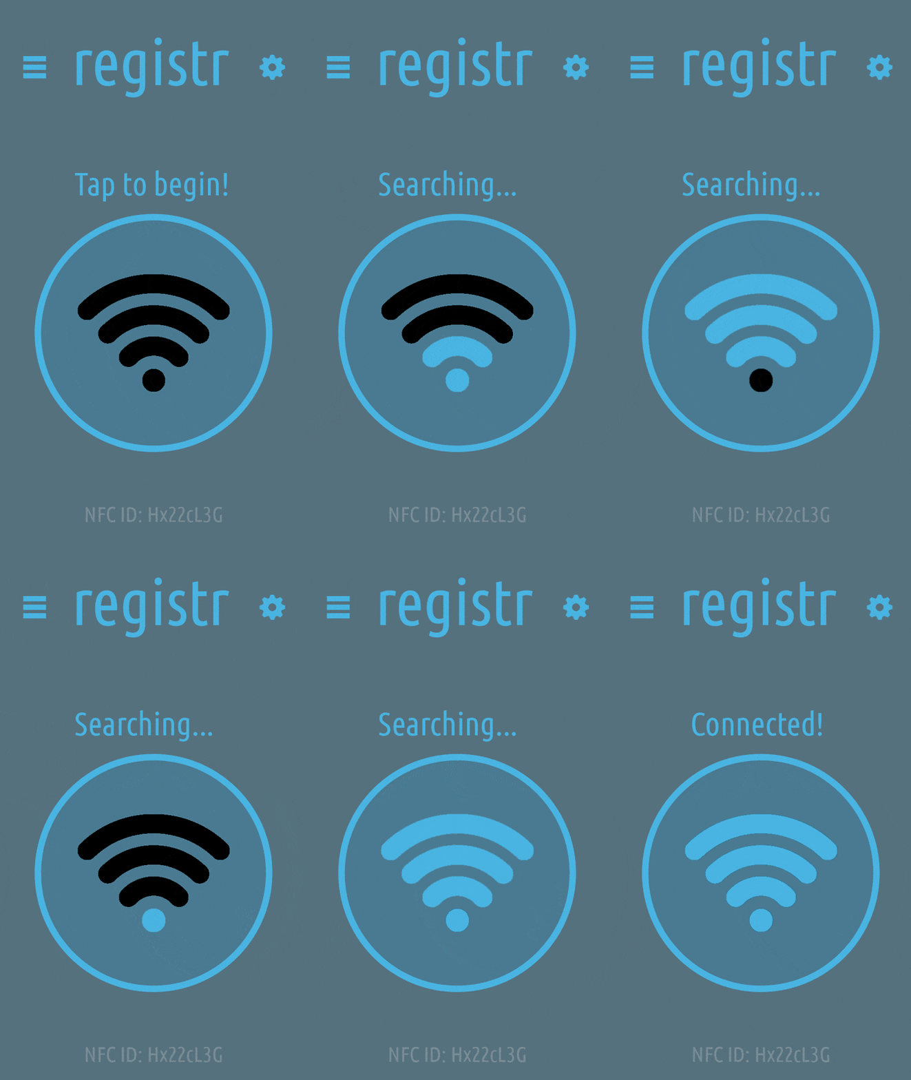
output_JqWLmV


This is an app concept idea I made quickly for fun.

SEE: Time and motion study, NFC/Bluetooth alternative to GPS


Indoor/Bluetooth GPS:

https://www.google.com/atap/projecttango/#project

http://www.infsoft.co.uk/Products/Indoor-GPS-Hardware

I’m trying to think of a way I can implement a system like this, but the only thing I can think of is military application. If a unit of soldiers mapped out a space in full 3D; the data could effectively be transmitted real-time from units on the ground and sent back to command; from here, along with IF tagging of the units, command effectively has a real-time 3D map they can interact with – something that would provide a huge tactical and strategic advantage over traditional helmet cams or satellite/drone feeds.

The device should be strapped to the helmets of the soldiers and, with hopefully a much larger FOV than is available now, this would allow for 3D real-time mapping of objects some distance away. If the information collected from each soldier’s cam is stitched together, it could create a decently accurate and sizeable 3D map of the area.

App + Icon, improved

My digital media workshop tutor today critiqued my previous work, and suggested further developments on how I could improve upon what I already had. These are those improvements.

Icon

The first step I took was to re-design my previous application icon. The previous consisted of a single blue house on a white background. Upon being reviewed, it became clear that the icon didn’t really give the message I was trying to send – for starters, it was a single house, which doesn’t exactly re-enforce the idea of “community”. Second, it looked very similar to a lot of application “home” icons. My re-designed icon, as can be seen above, is not all that much a drastic change from my previous icon. It was simply a case of copying the house and moving it over; but already  it looks a lot different. The fact there are two houses removes the connotations of homeliness, and instead re-enforces the idea of community.

Interface

My interface has had an extensive re-design; I did away with the swiping idea I had to instead focus on a more classic, user-friendly design based upon the previous “My Council” app. For this workshop, I wanted to focus on the icons, spacing and usability (I have not yet given the colour scheme much consideration). All the icons are supposed to be visually represent the text beneath them, although this is very difficult to do. “Jobs” could also easily be “news”. Nonetheless, I’m extremely pleased with how this turned out, and am looking forward to developing it further.

My own app icon + interface

This week, I was tasked with designing and creating my own app icon + interface. As I’m doing “local governments”, I’ve decided to try and improve upon the concepts seen within the previous two applications I spoke about in my previous blog post.

App icon

(App template is a royalty-free document – retrieved from http://appicontemplate.com/)

My application icon features a simple white square with a 2D image of a house. I wanted the application to be simple, but the contrast helps it become recognisable at a passing glance – especially against dark backgrounds. The house is meant to represent living and domestic life.

One issue I may face with this icon – as can be seen above – is that the edges of the application disappear against completely white backgrounds, leaving just the house icon. While I personally quite like that it does this, it may become problematic for those who have very light phone backgrounds. As such, in the future I may change the background colour to a faint beige or grey, to provide contrast in such cases.

App interface

This is a very rough mock-up of what I want my application interface to look and perform like. Unfortunately, now that I’ve finished it, the idea doesn’t seem as good; but until I can improve upon it, this will be my showcase.

The general idea was to have a clean and somewhat minimalist app with no intrusions or distractions. The options are to be about the icon the in the middle, which can be dragged to the option the user wishes to select. This will need some tweaking, or some instructions to be written on the page so that the user understands how it operates. The design didn’t turn out as balanced as I had hopes, with the lack of width available on mobile devices, it’s tough to try and fit the general concept I wanted without making the text too small, which would risk barring some people from being able to utilise the application. The colour scheme could also do with improvement.

Project Blog – “Local governments”

I have been tasked with finding a good and bad example of existing applications aimed around local governments. I will post screenshots of any apps that I find, and give a brief summary beneath about why I think the app is good or bad, and how it may be improved. All of this should help me work towards re-branding and improving upon an existing product.

My Council (1)

This application was the better of the two I found both called “My Council”. It features a nice menu that clearly details where every link leads, and contains several useful features such as “street reports” and “jobs”. I feel as though the title bar at the top could have been drastically reduced in size to save space, and the icons could have perhaps been reduced in size also; however the application is more than likely going to be used by the older generation, who for starters may not care about design, and as such this won’t bother them; furthermore, the large icons will also be useful for those that do not have such great eye sight.
One thing I liked a lot was the ability to report crimes, graffiti, etc, by “pinning” them on an embedded Google Maps function under the “street reports” page. The only downside to this is that an internet connection is required to display this content.

My Council (2)

In contrast to the previous application; this one, also named “My council”, features many poor design choices and unusual systems that make it a pain to use. As soon as the application is opened, the user is greeted with a splash screen featuring poorly placed logos over a stretched image with plain text – It’s not nice to look at, and seems as if it was thrown together in a rush. After this screen, the user is then invited to log in. While it isn’t necessary to log in to use the application, it seems strange to be able to create an account with the system. The main menu is not bad, but it’s not brilliant; the only way it seems connected to anything else in the app is by the colour scheme. A slightly crushed selection menu also flanks the bottom, allowing the user to discover more information. This bar at the bottom could probably have been better served in the list with everything else; but I feel the designers did this so that the user would not have to scroll. One bizarre occurrence is that when searching for the Lincoln city council, the embedded Google Maps displayed the location as within Lincoln Common. To give them the benefit of the doubt, however, this may well be a problem with Google Maps and not the application itself.